Turning Life Into Numbers

I’d never heard or seen a Feltron Report before, so as I opened the 2008 Report, I was surprised, impressed, inspired, and amazed.  Nicholas Felton, the creator of the Feltron Reports, was fascinated by charts and data, and one day decided to keep track of his life statistically.  Everyday he’d record what he did, when he did it, how long he did it for, etc. until his entire year was able to be put into numbers.  Music, travel, food, photos, and tons of minute details were apart of his annual reports, which he has been doing since 2006.  All these reports are available online to be viewed by anyone who wants to know everything about his life, or to be amazed by the lengths to which he’ll go to write them.

As I looked at the Feltron Report for 2008, I was immediately drawn to the design of it.  Being a graphic artist of sorts, the Feltron reports are visually stunning, with a lot of care put into the colors, graphs, maps, and charts that are easy to understand and stimulating to look at.  2008 for example is mostly grey, with white and lime green accents that make the data pop out.  The only exception to this is the map/atlas, which seems like a jumbled mess of triangles until you view it up-close.  The 2006 Report is better at this, with his maps of Manhattan being very easy to read with the black dots contrasting great on the yellow background.  However, the 2006 Report does show how far Felton has come in graphic design, with the visual differences between the two years very apparent; 2008 looks a lot more professional and entertaining.

One thing in his reports that caught my eye (2008 especially) is the music section, in which he tracks the number of songs he’s listened to, how many artists he’s played, the number of CDs he’s bought, and even a percentage breakdown of which artists made up his top 10 most played.  As an avid music lover, this part more than any inspired me, and even gave me a few ideas of doing something similar with my music in the coming year.  The amount of dedication it would take (and took Felton) is pretty staggering to just think about though, not to mention actively keeping track of all that data.  And that’s just for music, not even everything else he records.  The amount of work Felton puts into his reports is incredible, and has made viewing statistics interesting and fun, something that’s not easy to do.  It’s weird to think that our lives can be broken down into a few pie charts and maps, and that everything we do can be simplified into a percentage.  The Feltron Reports give light to the fact that our very lives are a science, something that can be dissected and studied; which when going about them, we never even have the thought cross our minds.
Replace Bradford Cox with Coldplay and you'll be pretty close to my own Feltron Report.

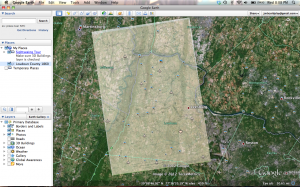
Google Earth Overlay

For my overlay, I used an old map of Loudon County dating back to 1860.  The county lines are extremely close to what they are presently, and so is the location of the Potomac River, which is only visibly off on the far right side of the map.  As for downloading and accessing Google Earth, the process took a long time since Google wants you to download Chrome along with Earth, which isn’t something I wanted to do, so I spent a lot of time trying to get around that.  The actual placing of the map onto Earth was easy enough, and even kind of fun lining up the corners and finding the right map to use.

Getting the map into this post was a pain though.  I don’t know how to embed my Google Earth places onto my blog, so instead I had to just take a screenshot and put that in this post.  You can clip on the image to get a bigger (and better) view of it.

Historical Digitalization

In William G. Thomas III and Edward L. Ayers’s article, The Differences Slavery Made, both men look into how slavery effected America before the Civil War, and what part it had in ultimately dividing our nation.  Throughout their work, they use digital sources of information, such as maps to provide evidence to their points.  In their analysis, they examine two counties, Augusta County, VA and Franklin County, PA, and how the two were similar and different during the years leading to the Civil War.

Being in Pennsylvania, Franklin County sided with the North during the war, and Augusta County with the South.  Each was a wealthy and productive county, with Augusta ranking first in Virginia’s value of farms, and Franklin ranking 10th in Pennsylvania.  Each was heavily tied to farming, with both producing a large quantity of wheat and corn, among other goods.  Each was heavily invested in manufacturing as well, with Augusta actually having higher investments in railroads, strange to think of when knowing they would be part of the Confederacy.  And how did Thomas III and Ayers come up with these statistics and knowledge?  By digitalizing documents to better understand them.

Under the Evidence section of their article, a large number of maps, charts, and records can be found, all digitalized for ease of use and access.  Using GIS (Geographical Information System), they were able to make soil maps, and using old census records added residency listings on these maps as well.  Finding trade records and more soil information allowed them to discover what types of agriculture were being grown with each plantation of both counties.  Using census records, correlations can be made between agricultural prosperity and slave-ownership, or how many industrial facilities were using slave labor versus free labor.  By wisely using current technologies, Thomas III and Ayers made an incredibly detailed and interesting study that without digitalization would have been long, boring, and difficult to read and maybe even impossible to create.  I find their use of digitalization amazing, and should be a standard to which all historians hold their work to in this age of technology.

Maps And Charts

Having been using Google Maps for about as long as I’ve been using the Internet, getting into building my own maps was an easy task.  Google’s made its map interface very user-friendly, and their tutorials are a help if you don’t know where to start.  For me, I just started playing around with the tools, and quickly became proficient in creating and editing the shapes, lines, landmarks, etc. that can be added to your custom map.

View My Awesome Map in a larger map

As for the charts, you can definitely tell it’s in a beta form.  I couldn’t actually get the preview on the right side of the page to show my chart, so to have a look at what my chart was like visually, I had to constantly view at as an image in a separate window.  It was very annoying and made the whole process twice as long.  Also, the Radar Chart is impossible to figure out.  After nearly 20 minutes of trying to create one, I gave up and went on to a Pie Chart; which was exponentially easier.  You’d have to be a savant to make even a half-way decent Radar Chart.
What I Think Of Google Charts

Overall, I love working with Google Maps, and found it fun and easy to use.  Google Charts on the other hand go can throw itself off a building.

My Security Analysis

My time on the Internet has been fairly short by most standards; I’ve only had a personal computer with online access since I was 14.  Starting off on the Internet so late (compared to most of this generation) has had its advantages, such as having a smarter, more grounded head on my shoulders, and thus not falling into the traps so many younger people have, such as having bad passwords, joining every site they come across, or playing so many free online games that their computer has a breakdown.  Even as I got accustomed to the web and dealing with it, I was very security-conscious, going out of my way to ensure what I was doing was safe for me personally and my computer.

Passwords have never been a problem for me.  I’ve never been a member of so many sites that I couldn’t remember which password went to which account, and as the years went on, and sites started needing more and more numbers, letters, caps, and symbols for their passwords, I quickly adopted them into my older passwords, which made it easier for my to remember even new passwords.  Like I said before, I also never had more than maybe 4 sites that I regularly visited with an account.  Even sites that I routinely go to I avoid making an account if possible.  I also never have my credit card saved on a site unless I use it extremely regularly, such as Amazon and my paypal account.  I don’t even have my card saved on my Steam account.  I also only use iTunes gift cards for my music purchasing, my credit card is not on my Apple account; and I get my music from either iTunes or from my personal CDs.  I’ve always had bad thoughts about torrents or pirating anything (games, music, etc.), in part because it’s illegal, and I’m never sure if the sites are safe or not.

When I had my PC, I had all the firewalls and the highest security settings for browsing the web.  I’d never download anything from a site I didn’t trust, and made it so that even stuff I would download needed to be scanned a number of times before it would start the process.  Since I’ve bought my Mac I’ve been a lot more lenient with what I do online.  Not that I’m less careful or visit every site no matter how shady it is, but the fact that Apple products have virtually no chance of getting viruses (not getting hacked though) compared to PCs, I don’t have to worry as much.  I still delete anything that starts immediately downloading when I visit a page, and never take any weird looking online surveys.  I’d say I have a very good, security-conscious way of interacting on the Internet, and with my Mac coupled with my hesitance in dealing with anything unfamiliar online, I have an extremely low chance of get a virus.  Sadly, hackers are still a problem, but I tend to not think about that too much.